


Let’s talk editing, folks. You know me—I’m not one to jump on every shiny new preset that comes along…however, I’ll try almost (see: Sepia) anything once. Call me Goldilocks, but I’ve got standards more particular than a film photographer with their last roll of discontinued Fuji 400h. My work’s been evolving (because, duh, that’s what artists do), and finding the right edit has been like searching for the perfect black and white cookie in New York City—it exists, but damn if it isn’t hard to find (that’s a list for another day if you’d like).
Enter stage left: The Editorial Edit.
Look, I’m not one to jump on every preset bandwagon that rolls by. But The Editorial Edit? It’s got me excited about post-processing in a whole new way. These presets aren’t just good—they’re a perfect fit for where my style is heading right now.
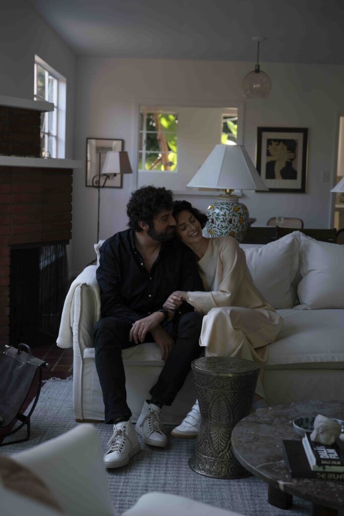
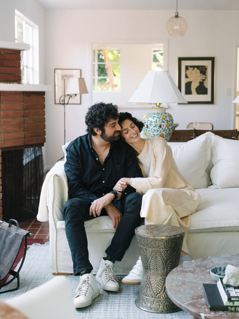
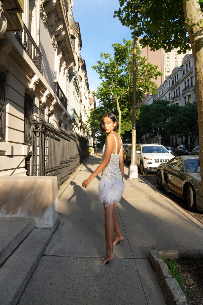
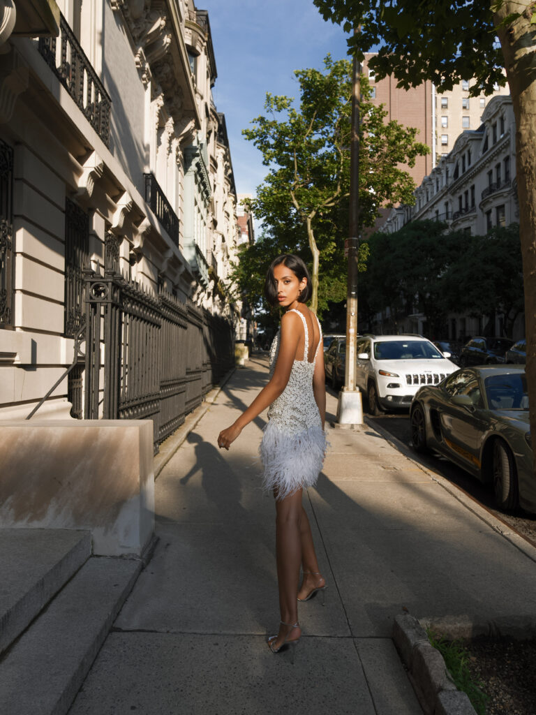
Before and after with Manzanita
Here’s the TEE (see what I did there?):
- Skin Tones That Hit Different: I’m all about accurate skin tones. It’s kind of my thing. And these presets and profiles? They nail it. We’re talking next-level perfection here. What about them specifically? It evens out skin tones in a way I haven’t been able to achieve and handles varied tones without sacrificing either. It’s like when Kodak came along, but for digital. I love that reds, oranges, and yellows don’t go wonky in unison. We’re more than 1 note over here.
- Greens That Actually Look Like, You Know, Green No more alien landscapes or nuclear fallout vibes. These greens are so true, you’d think Mother Nature herself coded them.
- Reds That Play Nice: Reds can be tricky in editing. But here? They behave themselves like well-trained show dogs. Why does this matter? Reds should be red and maintaining the colors of a florist’s flower, a guest’s dress, a linen…is…part of our job.
- A Nod to Film Without the Pretense: They’re not trying to be film. But they’re coming closer to the look of my Noritsu scans than I expected. And trust me, I’ve experimented with more presets than I’ve had espressos (that’s a lot, folks).
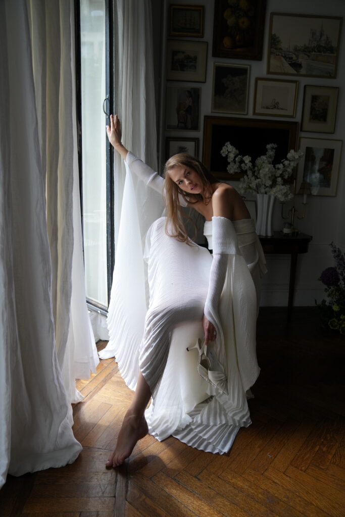
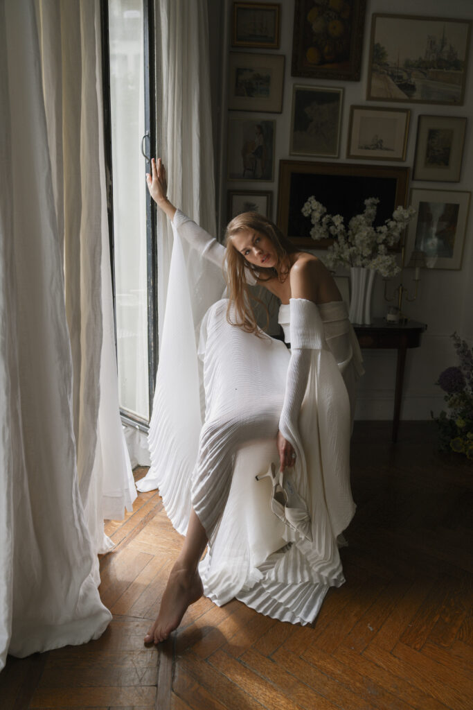
Before and After with Totuava
I’ve been quietly testing these for weeks, chatting about them with photographer friends like they’re some kind of industry secret. But the cat’s out of the bag now, and I really like cats. The Editorial Edit is here, and it’s seriously impressing this picky editor.
They’ve graciously extended a rollout discount. Use code NIKKID at checkout and you’ll snag 10% off. It’s not much, but hey, that’s a couple of oat milk lattes right there (for me too, thanks).
Got questions? Dying to know more? Slide into my DMs. I’m here, I’m caffeinated, and I’m ready to talk presets and profiles till my next wedding rolls around.
Parting words? Good editing doesn’t replace good photography (more on that later). But when you’ve got both? That’s when the magic happens. And The Editorial Edit? It’s adding a whole new dimension to my workflow.
Now if you’ll excuse me, I’ve got a stack of shoots to edit. But with these presets and profiles? I’m actually looking forward to it. And in this industry, that’s what we call a win.